Posts: 68
Threads: 2
Joined: Jul 2009
I guess this counts as scratchbuilding. At least it does in my book. Also I hate thread titles. Anyhow:
I'm slowly building a large box out of DPM wall segments for part of my brewery. I'm satisfied with what I like to call the black band (I dont know what those name-ribbons they loved to put on prewar buildings are actually called) and somewhat less than satisfied with my weathering/mortar job. The girlfriend says she thinks it looks fine and she's seen her share of factories (field engineer). Now my current issue, one I hope someone has experience in, is how to join the two big wall panels.
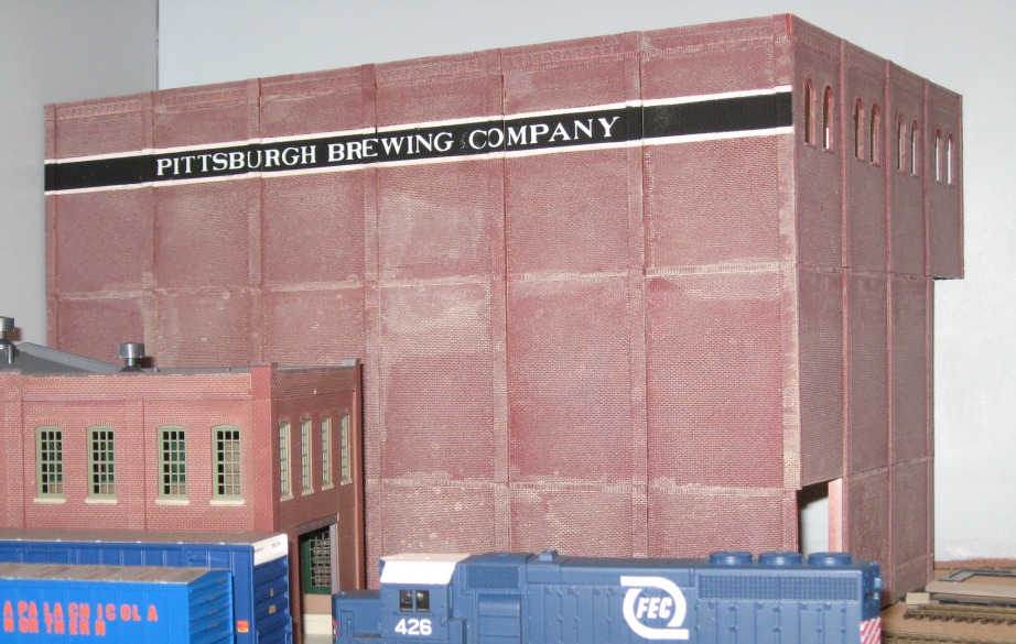
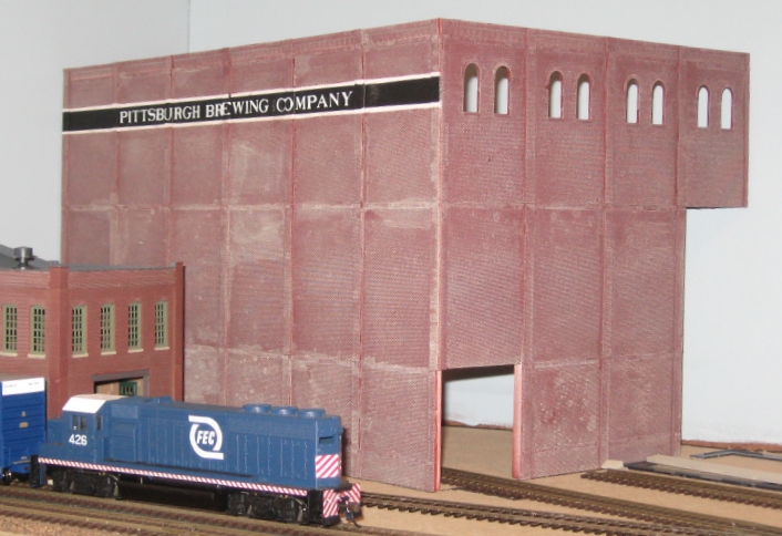
Right now they're floating free from each other. I'm not sure where to start, to be honest. The pilasters don't seem to give me much area in which to attempt to glue them together. I was thinking about gluing a strip of styrene to the one to give it some more area to attach the other wall to. Even so, my other great issue is how to hold such large parts together. I have no clamp large enough. Even if I did, I'm also not certain how to keep the two at a right angle to each other. I'm sure someone out there has some experience with this and I'd sure like to hear it.
Also I'm not sure what that FEC power is doing in Pittsburgh. Oh and the reason there's what looks like two missing parts on the right side of the windowed wall is because thats behind another structure and why waste parts you can't see.
Posts: 5,263
Threads: 195
Joined: Apr 2009
When I have to glue two walls together I put one flat on the table and the other standing up. I use some old hard disk (they are heavy and have perfect 90° angles) from the computer to hold and align the standing wall at an 90° angle. I make some triangle from plastic and glue them in the inner corner.
A wall of that size will also get at least one horizontal square wood stick (about 0.3 - 0.4") glued at the inside for more stability and to align the wall.
I like the mortal wash. You might do a black/dark gray wash next. Both will blend together fine.
How did you do the black band?
Reinhard
Posts: 1,817
Threads: 27
Joined: Dec 2009
First, The mortar on the walls looks fine! All it needs is a very light wash of alcohol/india ink to tone down/weather the surface and it will look great!
On the subject of bonding walls at 90°, I will agree with Reinhard.
Lay on wall flat on the table (I usually have a sheet of wax paper underneath) and then using such things a a combination square (or two or three) snuggled up to the outside of the vertical wall, holding it vertical (and therefore at 90°) I then gather the interior bracing that I have fabricated in advance, generally a "fat" vertical auxiliary gluing surface and several triangular gussets (notched to accept the "fat" vertical auxiliary gluing surface.)
The "fat" vertical auxiliary bonding surface more often than not is a styrene strip at least 1/8"x1/8" and sometimes 1/4"x1/4". The strengthening gussets are usually cut from 0.060" or 0.080" sheet styrene. The corner of the gusset must be at 90°. Except for the top and bottom gussets which can be located above and below the vertical stiffener, all other intermediate gussets must be notched to span the corner stiffener strip.
[The pieces ready for bonding into the corner …]
![[Image: CornerReinforcements.jpg]](http://i1022.photobucket.com/albums/af349/wwmarsland/Big%20Blue%202010%20Summer%20Structure%20Challenge/Packaged%20Goods%20Shipping/CornerReinforcements.jpg) [... my gussets have holes drilled in them to accept screws to mount the structure to the layout]
In prep for assembly, I generally “paint” one or two applications of lacquer thinner to the mating surfaces of both wall sections as well as the vertical stiffener to “soften” them in preparation to bonding.
The next steps happen quickly!
Now bring the wall sections together, using the combo squares and any 90° fixtures you may have fabricated and place the stiffener in the corner with a little pressure. Using a dime store “model” paint brush, paint lacquer thinner along both sides of the stiffener, and allow the liquid to “wick” in between the surfaces. Be fairly generous with the application of solvent. Press lightly along the length of the stiffener, insuring it is “seated.
Next, soften the mating surface (edges) of the gussets as you did the walls and stiffener and then place them equally spaced along the stiffener, again wicking solvent into the joint with the paint brush. Apply light pressure to each one, insuring that each is truly mating up to the interior corner.
[Corner stiffener and gussets bonded in place …]
![[Image: WallsReinforcedandBraced-1.jpg]](http://i1022.photobucket.com/albums/af349/wwmarsland/Big%20Blue%202010%20Summer%20Structure%20Challenge/Packaged%20Goods%20Shipping/WallsReinforcedandBraced-1.jpg)
It all sounds like a complicated process but if you follow the “mise en place” (pronounced Meez ahn plahs) routine used in the kitchen when preparing food for dinner, i.e., getting all the ingredients (parts) in place before beginning the project, there should be no need to panic and everything should take place in a progression of orderly steps.
Best of luck … it gets easier every time you do it!
biL
Lehigh Susquehanna & Western
"America will never be destroyed from the outside. If we falter and lose our freedoms, it will be because we destroyed ourselves." ~~Abraham Lincoln
Posts: 68
Threads: 2
Joined: Jul 2009
I really like the idea of using an old hard drive. They're pretty hefty for their size. I should also have the materials for the gussets. I wasn't particularly sure if that would work on something of this size, but evidently it will.
As for how I did that band, I spraypainted a portion of the wall white. My calculations showed that the size I'd figured for the band was about an inch and a quarter if I recall correctly. So I layered two strips of 1" blue painters tape where the band would be, then gave it a light coat of white again to seal down the edges of the tape. Then I hit it with the red for the brick. I believe it's Boxcar red. It was a pretty intense brown-red. After that, I removed the tape so I had a nice white strip. I carefully masked the bottom and top 1/8th of an inch of the band with more blue tape, then ran a few layers of 2" masking tape on the top and below the band, then covered most of the wall with a sheet of scrap cardboard to save tape. I tried something different and sealed the tape down with dullcote instead of more white paint. It worked. The exposed part of the band was then sprayed black. I was really surprised it all worked exactly as planned the first time. The lettering is done with dry transfers, which I found a little cumbersome. I was often picking little scraps of letter off the building, where my fingers had rubbed an odd part of an O on something when I was really laying down a G or something. In the future, I would probably use regular decals.
I'd planned on hitting it with Dullcote today before attempting an India Ink wash but the weather conspired against that.
Posts: 5,859
Threads: 175
Joined: Dec 2008
BiL and Reinhard have pretty-well covered the procedure for assembly, although I prefer to use all-styrene construction rather than a combination of styrene and wood - the joint between styrene parts is generally much stronger than when using dissimilar materials, especially if you're using ca. If you must use wood with styrene, contact cement is a much better choice.
For large structures, I like to use interior walls and floors to add strength. If you buy a 4'x8' sheet of .060" styrene, it's much cheaper than using pre-formed strips, such as those from Evergreen. The strips are useful in some applications, though.
![[Image: Structurebracing006.jpg]](http://i23.photobucket.com/albums/b399/doctorwayne/structures%20and%20a%20few%20b%20and%20w%20photos/Structurebracing006.jpg)
![[Image: Structurebracing003.jpg]](http://i23.photobucket.com/albums/b399/doctorwayne/structures%20and%20a%20few%20b%20and%20w%20photos/Structurebracing003.jpg)
![[Image: Structurebracing013.jpg]](http://i23.photobucket.com/albums/b399/doctorwayne/structures%20and%20a%20few%20b%20and%20w%20photos/Structurebracing013.jpg)
An easy way to do painted wall banners is similar to the method which you used, but with one twist. After the brick has been painted and the mortar treatment done, mask the wall and paint the area for the sign white (you can use other colours, too, or reverse the colours to get dark lettering on a light background). The next step is the key to accomplishing a sign that can be lettered in any colour and is more permanent than decals or dry transfers.
Apply the lettering using dry transfers, but don't burnish them in place. The colour of the transfers is not important, as they're used only as a masking device. For borders, etc. use masking tape cut to suit. Next, mask of the areas not part of the sign, and spray with your colour of choice - I like black and white, as this was a very common choice in my mid-'30s modelling era. As soon as the paint has dried to the touch, remove the masking tape, then use bits of masking tape to dab at the lettering - the dry transfers should lift easily, revealing the colour below.
![[Image: Foe-toesfromTrainPhotos2007thirdcd4.jpg]](http://i23.photobucket.com/albums/b399/doctorwayne/structures%20and%20a%20few%20b%20and%20w%20photos/Foe-toesfromTrainPhotos2007thirdcd4.jpg)
![[Image: Freightcarphotosandlayoutviews015.jpg]](http://i23.photobucket.com/albums/b399/doctorwayne/structures%20and%20a%20few%20b%20and%20w%20photos/Freightcarphotosandlayoutviews015.jpg)
![[Image: Cropped.jpg]](http://i23.photobucket.com/albums/b399/doctorwayne/structures%20and%20a%20few%20b%20and%20w%20photos/Cropped.jpg)
This one was done in the same manner, but the large letters were cut from masking tape. Simply apply the tape to a sheet of glass, lay out the letters using a pencil and straightedge, then cut them out using a fresh blade in your X-Acto.
![[Image: Morefull-sizedGERNfoe-toes004.jpg]](http://i23.photobucket.com/albums/b399/doctorwayne/GERN%20INDUSTRIES/Morefull-sizedGERNfoe-toes004.jpg)
This one, on the end of an adjoining structure, used dry transfers for all but the large "GERN", which was drawn mostly free-hand, then cut from masking tape. To apply it over the pilasters without distorting the shape, the "E" and "R" were cut along the edge of the pilasters, then smaller strips of masking were used to cover the exposed edge of the pilaster. For some reason, the sign painters forgot to include the apostrophes.     
![[Image: GERNsign002.jpg]](http://i23.photobucket.com/albums/b399/doctorwayne/GERN%20INDUSTRIES/GERNsign002.jpg)
Wayne
Posts: 1,817
Threads: 27
Joined: Dec 2009
Well, I was hoping you'd join the instructional presentation, doctorwayne, as I knew that whichever of the finer points that Reinhard or I overlooked, you would cover in spades, and then some. I was not disappointed ...
... and as usual ...
... I, too, learned a few new things! [There's a wealth of information in those photos if you take the time to study them!]
Thanks!
biL
Lehigh Susquehanna & Western
"America will never be destroyed from the outside. If we falter and lose our freedoms, it will be because we destroyed ourselves." ~~Abraham Lincoln
Posts: 68
Threads: 2
Joined: Jul 2009
While I was out running errands today I picked up some india ink. What sort of ratio to thinner would work best for a wash for this sort fo application? I'm assuming its mixed with alcohol, and mostly alcohol at that.
Posts: 5,859
Threads: 175
Joined: Dec 2008
I haven't used India ink often, so I generally put some alcohol in a paint jar, then add a few drops or a brushload of ink. Try it on something, then adjust accordingly. It's easier to start too light and gradually add ink than it is to start too dark and have to go out to buy more alcohol to lighten the mix.  Keep in mind that anything to which you've applied Dullcote will turn milky in appearance when the weathering wash dries. After you get over the initial panic, a simple re-spray with Dullcote will restore the appearance.  
Wayne
Posts: 1,817
Threads: 27
Joined: Dec 2009
The India Ink solution (no ... that's an unintended pun) ...
I put about an ounce or so of alcohol in an empty "#1 style" baby food jar along with about three to four drops of india ink.
The walls in question had been "tuck pointed" with cheap Ace Hardware spackle and the sealed with Testor's DullCote. (I bring this up to follow up with a visual relating to the comments by doctorwayne.) The wall looked like this at that point ...
![[Image: TuckPointingTestResult1-1.jpg]](http://i1022.photobucket.com/albums/af349/wwmarsland/Big%20Blue%202010%20Summer%20Structure%20Challenge/Packaged%20Goods%20Shipping/Detailing%20the%20Walls/TuckPointingTestResult1-1.jpg)
I then "floated" on a wash of the alcohol/India ink solution, covering the whole surface, applying the wash in verticle strokes with a 1/2" wide brush from top to bottom, but tilting the wall up at the top slightly on the workbench, allowing the solution to gather more heavily towards the lower regions of the wall section, I left it to dry. On my return, PANIC set in ...  hock:
![[Image: ABadAlcohol-IndiaInkWash.jpg]](http://i1022.photobucket.com/albums/af349/wwmarsland/Big%20Blue%202010%20Summer%20Structure%20Challenge/Packaged%20Goods%20Shipping/Detailing%20the%20Walls/ABadAlcohol-IndiaInkWash.jpg)
The alcohol reacted adversely with the DullCote!!  I washed the India ink wash off the wall section, resulting in a wall that looked again like the first photo. Once again, I applied the wash the same way, with the same result. I then learned (from asking the question here) that I should just shoot another coat of DullCote and all would be good. Thats what I did and the result was ...  
![[Image: PaintRemovedtoAttachtheEndRoof.jpg]](http://i1022.photobucket.com/albums/af349/wwmarsland/Big%20Blue%202010%20Summer%20Structure%20Challenge/Packaged%20Goods%20Shipping/Detailing%20the%20Walls/PaintRemovedtoAttachtheEndRoof.jpg)
The results are satisfying! Give it a try ... the worst that can happen is it looks to light and you need a second treatment. Just keep the ink solution very weak ... you can always add more, but it's tough to remove one coat.
biL
Lehigh Susquehanna & Western
"America will never be destroyed from the outside. If we falter and lose our freedoms, it will be because we destroyed ourselves." ~~Abraham Lincoln
Posts: 5,263
Threads: 195
Joined: Apr 2009
radivil Wrote:While I was out running errands today I picked up some india ink. What sort of ratio to thinner would work best for a wash for this sort fo application? I'm assuming its mixed with alcohol, and mostly alcohol at that.
I test my wash on a white paper tissue. A brush with wash should make a medium to light gray spot on a paper tissue. A black spot is much to many color in the mix. Dark gray is do dangerous because you have no chance of a second layer and a light background (e.g. reefer) might be ruined already-
Remember, it is intended to have multiple layers of wash in most cases.
Reinhard
Posts: 68
Threads: 2
Joined: Jul 2009
I was able to work today and I'm pretty pleased with how it turned out. I was only able to get one picture that's not that great. The camera's batteries are all but dead.
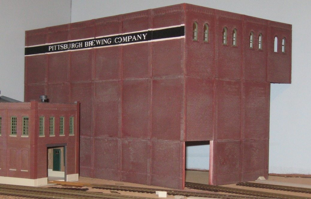
The wash took almost all the white out of the mortar and kinda makes it look like it has black mortar. Or in some parts my eye says theres just the brick red. But honestly I like how it looks. A lot of my pictures I have of buildings from a distance have that appearance. I can pick out the brick detail but not the color of the mortar lines. But like I said, I like how it looks. I don't think its too shabby for the first time I've ever done something like this.
While previewing this post, I noticed a window has gone missing. Hrm!
Posts: 5,859
Threads: 175
Joined: Dec 2008
radivil Wrote:The wash took almost all the white out of the mortar and kinda makes it look like it has black mortar. Or in some parts my eye says theres just the brick red. But honestly I like how it looks. A lot of my pictures I have of buildings from a distance have that appearance. I can pick out the brick detail but not the color of the mortar lines. But like I said, I like how it looks. I don't think its too shabby for the first time I've ever done something like this.
Looks good to me, too. 
radivil Wrote:While previewing this post, I noticed a window has gone missing. Hrm!
Maybe it got "washed" away.  
I didn't bother with "mortar" on these structures:
![[Image: Somelayoutviews004.jpg]](http://i23.photobucket.com/albums/b399/doctorwayne/structures%20and%20a%20few%20b%20and%20w%20photos/Somelayoutviews004.jpg)
The one in the foreground got several washes of almost-black PollyScale, while the one in the background was done with a lighter grey.
This one also was done with no specific mortar, only washes of lighter grey. The brick colour is Floquil Reefer Orange:
![[Image: Freightcarphotosandlayoutviews038.jpg]](http://i23.photobucket.com/albums/b399/doctorwayne/structures%20and%20a%20few%20b%20and%20w%20photos/Freightcarphotosandlayoutviews038.jpg)
Another brick structure done in Reefer Orange, this one got drywall mud for mortar, and then several washes of grey:
![[Image: Foe-toesfromfirstcd234.jpg]](http://i23.photobucket.com/albums/b399/doctorwayne/structures%20and%20a%20few%20b%20and%20w%20photos/Foe-toesfromfirstcd234.jpg)
![[Image: CopyofFoe-toesfromfirstcd267.jpg]](http://i23.photobucket.com/albums/b399/doctorwayne/structures%20and%20a%20few%20b%20and%20w%20photos/CopyofFoe-toesfromfirstcd267.jpg)
Wayne
Posts: 38
Threads: 0
Joined: Dec 2011
As Carl Sagan said "If you want to make an apple pie from sctratch, you must first create the universe!"
So what if you start with pre-made pie crust, if you didn't start with a substatially complete model, it's scratchbuilding, and yours looks great!
We all work with what we think is reasonable, I rarely bother to refine crude oil into plastic or smelt my own brass....
Eccentric-Crank
radivil Wrote:Quote:I guess this counts as scratchbuilding. At least it does in my book. Also I hate thread titles. Anyhow:
I'm slowly building a large box out of DPM wall segments for part of my brewery. I'm satisfied with what I like to call the black band (I dont know what those name-ribbons they loved to put on prewar buildings are actually called) and somewhat less than satisfied with my weathering/mortar job. The girlfriend says she thinks it looks fine and she's seen her share of factories (field engineer). Now my current issue, one I hope someone has experience in, is how to join the two big wall panels.
Posts: 3,755
Threads: 44
Joined: Dec 2008
radivil the walls look great and so does the band, good work! 
Mike
Sent from my pocket calculator using two tin cans and a string
Posts: 1,682
Threads: 101
Joined: Dec 2011
Thanks for the tutorial Wayne. The dry-transfer technic is quite interesting. Is there a reason why you just don't burnish the dry transfer instead of using it as a masking device?
@Radivil: depending your modelling era, which seems to be quite modern compared to your structure, you can touch up your wall as you want since the actual building maybe have since many overhaul over its existence. No need to have a perflectly even color or weathering. Just remember that sooth and other pullutant accumulate where they can't be washed down by rain. Under cornices, roof overhangs, pilasters and windows sills. It can be done quite easily and will complete your weathered structure nicely!
About mortar color. I work in architecture, mostly on heritage buildings. You won't find gray mortar on buildings built before Portland cement was common, let's say all buildings before the late 30's... Back then, they used a lot of lime and sand, which gives a tan color. Often, they were cheap on mortar and it was common to see very thin mortar line that blended themselves together with the brick work. After a few normal weathering, everything looked the same. You will also see a lot of colored mortar lines. Mostly used with brown brick and yellow brick were black or very dark mortars. I have also often seen red mortars with red bricks. Colored mortar is still widely used nowaday.s, but normal mortar are grayer because of Portland cement. Since a few years, many new mortar developped for heritage buildings and traditionnal brick work use small amount of Portland cement and reincorporated lime.
Keep in mind that mortar looks pale only when new. It catch and retains easily pollution, grime and dust. After few years, it turns quite dark. So use light colored mortar with caution and try to use more "earth-colored" colors. On some brick buildings I painted, I ofter used very light colored mortar to represent repairs. Often in real life, this kind of job is done by someone who doesn't know how to do it right and it looks botched (larger, brighter, etc.).
Also, older buildings were often built with different color bricks because each element didn't received the same amount of heat in the kiln. The was slight variation in the brick. I think Chris Nevard modelling work is an excellent representation of that. He dullcoat the model then use cheap color pencil to represention brick color variation. His Mendip Colliery feature such a building. It's worth a try I think.
http://www.flickr.com/photos/nevardmedia...6702004648
BTW, messing with colors can be interesting. This vintage painted ad was discovered when a building burn down in Montreal. It was painted between 1925-1930. This kind of lettering could be easily reproduced with commonly available dry transfer. I like the mortar lines that are showing off under the paint.
![[Image: puboldchum.jpg]](http://ruemasson.com/wp-content/uploads/2010/08/puboldchum.jpg)
Matt
|


![[Image: CornerReinforcements.jpg]](http://i1022.photobucket.com/albums/af349/wwmarsland/Big%20Blue%202010%20Summer%20Structure%20Challenge/Packaged%20Goods%20Shipping/CornerReinforcements.jpg)
![[Image: WallsReinforcedandBraced-1.jpg]](http://i1022.photobucket.com/albums/af349/wwmarsland/Big%20Blue%202010%20Summer%20Structure%20Challenge/Packaged%20Goods%20Shipping/WallsReinforcedandBraced-1.jpg)
![[Image: Structurebracing006.jpg]](http://i23.photobucket.com/albums/b399/doctorwayne/structures%20and%20a%20few%20b%20and%20w%20photos/Structurebracing006.jpg)
![[Image: Structurebracing003.jpg]](http://i23.photobucket.com/albums/b399/doctorwayne/structures%20and%20a%20few%20b%20and%20w%20photos/Structurebracing003.jpg)
![[Image: Structurebracing013.jpg]](http://i23.photobucket.com/albums/b399/doctorwayne/structures%20and%20a%20few%20b%20and%20w%20photos/Structurebracing013.jpg)
![[Image: Foe-toesfromTrainPhotos2007thirdcd4.jpg]](http://i23.photobucket.com/albums/b399/doctorwayne/structures%20and%20a%20few%20b%20and%20w%20photos/Foe-toesfromTrainPhotos2007thirdcd4.jpg)
![[Image: Freightcarphotosandlayoutviews015.jpg]](http://i23.photobucket.com/albums/b399/doctorwayne/structures%20and%20a%20few%20b%20and%20w%20photos/Freightcarphotosandlayoutviews015.jpg)
![[Image: Cropped.jpg]](http://i23.photobucket.com/albums/b399/doctorwayne/structures%20and%20a%20few%20b%20and%20w%20photos/Cropped.jpg)
![[Image: Morefull-sizedGERNfoe-toes004.jpg]](http://i23.photobucket.com/albums/b399/doctorwayne/GERN%20INDUSTRIES/Morefull-sizedGERNfoe-toes004.jpg)


![[Image: GERNsign002.jpg]](http://i23.photobucket.com/albums/b399/doctorwayne/GERN%20INDUSTRIES/GERNsign002.jpg)


![[Image: TuckPointingTestResult1-1.jpg]](http://i1022.photobucket.com/albums/af349/wwmarsland/Big%20Blue%202010%20Summer%20Structure%20Challenge/Packaged%20Goods%20Shipping/Detailing%20the%20Walls/TuckPointingTestResult1-1.jpg)
 hock:
hock: ![[Image: ABadAlcohol-IndiaInkWash.jpg]](http://i1022.photobucket.com/albums/af349/wwmarsland/Big%20Blue%202010%20Summer%20Structure%20Challenge/Packaged%20Goods%20Shipping/Detailing%20the%20Walls/ABadAlcohol-IndiaInkWash.jpg)


![[Image: PaintRemovedtoAttachtheEndRoof.jpg]](http://i1022.photobucket.com/albums/af349/wwmarsland/Big%20Blue%202010%20Summer%20Structure%20Challenge/Packaged%20Goods%20Shipping/Detailing%20the%20Walls/PaintRemovedtoAttachtheEndRoof.jpg)
![[Image: Somelayoutviews004.jpg]](http://i23.photobucket.com/albums/b399/doctorwayne/structures%20and%20a%20few%20b%20and%20w%20photos/Somelayoutviews004.jpg)
![[Image: Freightcarphotosandlayoutviews038.jpg]](http://i23.photobucket.com/albums/b399/doctorwayne/structures%20and%20a%20few%20b%20and%20w%20photos/Freightcarphotosandlayoutviews038.jpg)
![[Image: Foe-toesfromfirstcd234.jpg]](http://i23.photobucket.com/albums/b399/doctorwayne/structures%20and%20a%20few%20b%20and%20w%20photos/Foe-toesfromfirstcd234.jpg)
![[Image: CopyofFoe-toesfromfirstcd267.jpg]](http://i23.photobucket.com/albums/b399/doctorwayne/structures%20and%20a%20few%20b%20and%20w%20photos/CopyofFoe-toesfromfirstcd267.jpg)

![[Image: puboldchum.jpg]](http://ruemasson.com/wp-content/uploads/2010/08/puboldchum.jpg)