Posts: 1,817
Threads: 27
Joined: Dec 2009
One alternative I have not seen investigated so far is a building that is a bit "farther away" ... across the street and all the way on the other side of the parking lot. Maybe there is a tree or two along this side of that parking lot along the road that's maybe between the buildings.
Just trying to brainstorm the problem ... identify as many possible solutions to the possible, without making value judgements on any of them right now ... just generating ideas.
When the steam pressure subsides and no further ideas are forthcoming, then is the time to look at the feasability of each, eliminating the obviously unworkable ones and evaluating those remaining.
Process ... using it will help you to achieve your goal.
biL
Lehigh Susquehanna & Western
"America will never be destroyed from the outside. If we falter and lose our freedoms, it will be because we destroyed ourselves." ~~Abraham Lincoln
Posts: 3,683
Threads: 118
Joined: Jan 2009
I just came back in from painting the building on the wall. biL, your idea is what I had in mind the whole time! The building is supposed to be across the street. :oops: Your idea of a tree or two at the "street" is not a bad idea. This would be like the Walgreen's building over by MetroBank. On that note, I will be painting in either telephone poles or street light poles on the other side of the "street" which is in line with the bridge, and they would be in front of the painted building. That idea came from the origina; photos I was using for the treeline.
The idea of generating many possible ideas, and then logically arriving at which is the best is a good one. Although I try to do that, in my haste to accomplish things, I often have the "oh darn!" moment when I realize I should have done things a different way. " Why didn't I think of that!?"
Here is an overall photo of what I have now, with the 3D buildings and some trees in place. I did raise the painted building up a tad as per docWayne's suggestion, and the extra area underneath has been done starting dark at the bottom and transitioning to lighter gray at the building foundation.
Does it look like the building could be across the street?

The painted building could still be added on to as per Steamtrain's suggestion, just paint right over the trees.
Posts: 1,817
Threads: 27
Joined: Dec 2009
biL
Lehigh Susquehanna & Western
"America will never be destroyed from the outside. If we falter and lose our freedoms, it will be because we destroyed ourselves." ~~Abraham Lincoln
Posts: 3,683
Threads: 118
Joined: Jan 2009
Posts: 1,817
Threads: 27
Joined: Dec 2009
Gary S Wrote:... use of the various spaces in your replies! ...
Space is a wondrous and fascinating thing ...
... both Positive and Negative space ...
Wow! I just noticed a "gathering of structures in the distance to the left ...
Nice touch!
biL
Lehigh Susquehanna & Western
"America will never be destroyed from the outside. If we falter and lose our freedoms, it will be because we destroyed ourselves." ~~Abraham Lincoln
Posts: 3,683
Threads: 118
Joined: Jan 2009
I remember reading about negative space the other day when I was studying tree branches on the net. Only thing is, I was so engrossed in the branches that I ignored the negative space. Gotta go back and read that again! I'll have to search for the site - it did have some really great branch drawings.
I'm getting the feeling that a painted backdrop is sort of like a power point slide show. You're really never finished, there are always enhancements that can be made. The painted building on theright is too clean, it needs more shadow under the dock canopy, and maybe a general "grunging up". And I believe it also needs a light blue wahs to mute it out some. I did that on the previous background buildings, I like the look.
On the tiny buildings on the left, well, they say a backdrop is there to enhance, not to be center stage, so if it took you a bit to notice them, I guess that is good. 
Posts: 5,859
Threads: 175
Joined: Dec 2008
Gary S Wrote:Does it look like the building could be across the street?

It looks that way to me, Gary, and it also matches up well with the road going over the painted bridge. I like those structures added to the painted backdrop on the left, too.
Wayne
Posts: 76
Threads: 2
Joined: Nov 2010
Gary, I have to admit :oops: that I've been just lurking but avidly reading your progress and everyone's input. Fascinating thread and I'm learning a lot that I hope I can apply to my backdrop.
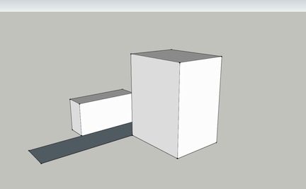
I've made a quick SketchUp model of what I believe is the layout of the buildings in discussion and the road between them (the darker rectangle). Here's a regular 3/4 view from the left if both buildings would be modelled:

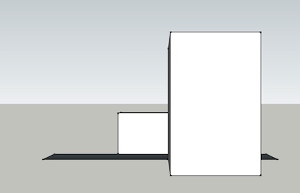
And then the view that I think you are trying to achieve, ie. a head-on view from the front:

Not entirely sure if that is reinforcing what you did or gives you more insight. As you can see the bottom of the rear building is higher due to the distance from the viewer as per what docWayne suggested. Maybe what is missing is the road itself? If you require any other views from this model, please let me know and I'll post them.
Keep up the excellent work! Eager to see the final version. 
Marc
Bar Extension - 5' x 2.5' N-scale layout plus two decks of shelf layout
Posts: 2,458
Threads: 57
Joined: Dec 2008
Aha....!!! So it isn't raising the horizon necessarily, but raising the background building....I knew it had something to do with the vertical relationship between the two buildings... 
Gus (LC&P).
Posts: 1,817
Threads: 27
Joined: Dec 2009
If you lower the horizon, the "road" becomes more of a line and the base of the rearmost building comes down. There is an inter-relationship between all of the different elements in the scene.
But the "Sketch-it" sketch was helpful in exposing that inter-relationship. That was a nice addition to the discussion. You have a solid understanding of "Wa's Hap'nin'!" 
biL
Lehigh Susquehanna & Western
"America will never be destroyed from the outside. If we falter and lose our freedoms, it will be because we destroyed ourselves." ~~Abraham Lincoln
Posts: 3,683
Threads: 118
Joined: Jan 2009
NGN, thanks for that study. I need that program! The painted building is a bit above the backdrop/layout junction. With the painted horizon so low, there is a limit to how much it can be raised. Here is a photo of the space between the layout and the building. The building is up about 1/4 inch. The very low horizon doesn't leave much room for the street under the building. I bascially just attempted to put a dark gray at bottom to light gray at building foundation transition.

Before I started on the building, I was looking at the street, and because the way the bayou bank is lower on the left than the right, the street would actually be below the parking lot levels. That's how it is supposed to be, we can't really see the street because the parking lots are higher. Now of course, what it is supposed to be doesn't matter if the illusion doesn't work. Here is a sideview of how I envision the terrain, street, and buildings to be. Again, this is a view as if one were standing on the bridge to the left and looking at the sides of the buildings:

Posts: 1,229
Threads: 23
Joined: Dec 2008
Looks super so far! I agree that it is indeed shaping up to be a well balanced scene. One particular shot you took that included the layout edge just below the side slope of the canal really impressed upon me how the backdrop can actually draw you into the depth of the scene and draw your eyes AWAY from the edge.
I am terrible for looking 'backstage' as it were, when looking at others layouts in person. I like to see what's under the valance (which is why I have avowed to NOT use one on my current layout) and find that the bright area above distracts me from the dark area above, and the contrast itself is too stark. Yes, more light has been directed onto the layout, but even so the valance is distracting.
I mention all that to say that your very successful experiments with painting perspective are striking the balance between drawing you into the scene and being a distraction. I'm sure once you're running trains through the scene, the foreground interest will keep you from focusing on the backdrop as it should, but the backdrop will not distract away from that foreground interest and indeed will reinforce the illusion of being somewhere else.
Finally, so many of the layouts I've operated on recently have been set in the heavily-forested Pacific Northwest. There's forest green, then a lighter shade of forest green, and another shade...you get the idea. How refreshing to see Texas. Boy...never thought I'd say that...  hock: 
Galen
I may not be a rivet counter, but I sure do like rivets!
Posts: 3,683
Threads: 118
Joined: Jan 2009
Thanks Galen, I'm glad I gave it a shot. Painting is was fun and rewarding. I'll say again that with the layout being at 58" allowing for a low horizon, it sure simplified the process.
Posts: 255
Threads: 4
Joined: May 2010
[quote="Gary S"]NGN, thanks for that study. I need that program! The painted building is a bit above the backdrop/layout junction. With the painted horizon so low, there is a limit to how much it can be raised. Here is a photo of the space between the layout and the building. The building is up about 1/4 inch. The very low horizon doesn't leave much room for the street under the building. I bascially just attempted to put a dark gray at bottom to light gray at building foundation transition.

Before I started on the building, I was looking at the street, and because the way the bayou bank is lower on the left than the right, the street would actually be below the parking lot levels. That's how it is supposed to be, we can't really see the street because the parking lots are higher. Now of course, what it is supposed to be doesn't matter if the illusion doesn't work. Here is a sideview of how I envision the terrain, street, and buildings to be. Again, this is a view as if one were standing on the bridge to the left and looking at the sides of the buildings:

Very nice work. All the backgrounds look very good. A touch of shadowing on the recessed corners areas of the over head doors may add to the 3D perspective.
Larry
Posts: 3,683
Threads: 118
Joined: Jan 2009
Thanks Larry. There are shadows to the left of each colume and under the canopy and the uppermost horizontal beam. But as you mention, they need to be more distinct. Since that photo was taken, I have given the building a blue wash, and shaded in the entire bottom of the building because of the canopy. I agree that the shadows need to be more pronounced, and will go back and do that at some point.
I appreciate you taking a look and making suggestions. 
|


 ...
...  ...
... 


 hock:
hock: 